Let’s Study Horror Games: Belated Memorial Day Weekend Catch-up

So, this is embarrassing. I actually did conclude the initial 10-episode run of Let’s Study Horror Games by the end of April. But I forgot to cross-post the video here once I uploaded it to YouTube. And then I made an 11th episode, and realized I still hadn’t announced the 10th one. And then weeks went by, and I fretted about, wondering how I should announce both videos on the blog. All of this is much more worry than it’s worth, so I finally just decided to announce them both in this post.

Episode 10 is an extension of some themes I delved into in this old blog post. (I had originally wanted to include Eternal Darkness: Sanity’s Requiem in that post, but it takes a lot of persistence to get the “save game deletion” sanity effect in that game, and there’s no way to reliably capture it unless you’ve committed yourself to capturing the entire game.) It marks the end of my formal plan for this series: any subsequent videos I release in it will take a more odds-n-ends approach, with no more multi-episode argumentative arcs.

Episode 11 inaugurates the more odds-n-ends phase. It focuses on sound, including musical scores, and includes within it a video version of this short lesson plan segment.

No transcript this time around, as it would be too unwieldy.
Let’s Study Horror Games, ep 7

The saga continues. This one’s dedicated to the Siren franchise, which means it’s a more in-depth version of some ideas I first poked around in in the tail end of this lesson plan.

I wanted to finish up this ep because it caps off a four-episode sequence that begain with ep 4. But my hiatus from this series is beginning now. Next up: catching up on interesting games from 2018.

Script below the jump.

Continue reading

Interesting Games of 2017: GUIness

emily_is_away_too_screenshot-02

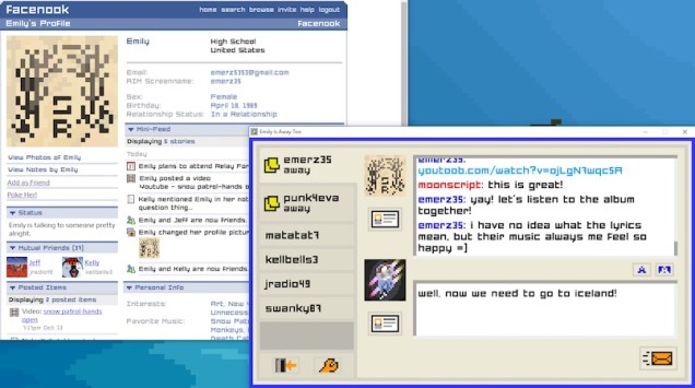
I first broached the topic of GUIness in the context of talking about cinema and television. In recent years, everyday, quotidian technology has thrown visual storytellers for a loop. Telephone conversations are well-built into the foundations of cinematic storytelling. Even the most mediocre director can successfully weave a phone conversation into a variety of scenarios, from suspense to romance.

Texting presents far more of a challenge. It’s sort of ironic, really: Even working within the medium of silent film, D. W. Griffith realized how powerfully cinematic a telephone conversation could be, as illustrated in his 1909 film The Lonely Villa. Today, though, texting makes some directors pine for the intertitle, that vestigal bit of cinematic vocabulary that lost most of its relevance with the coming of sound. The most advanced forms of experimentation along these lines have thrown out the traditional language of moving image storytelling altogether, instead telling stories by directly throwing GUIs on the screen.

Google’s 53-second “Parisian Love” ad for the 2010 Superbowl marked an early instance of this trend, but the style soon leaked out of advertising and into commercial narrative filmmaking. The experimental student film Noah (Walter Woodman and Patrick Cederberg, 2013) seems to have been a bellwether here. In its wake, both The Den (Zachary Donahue, 2013) and Unfriended (Leo Gambriadze, 2014) used the technique as a twist on the “found-footage” horror trope. The Modern Family episode “Connection Lost” (2015) brought the GUI style to mainstream television.

When I first considered this trend, I connected it to videogames in only the most slantwise manner. 2017 made me reconsider this, though. We are very clearly in the middle of a GUIness trend in gaming.

Continue reading

Wii Hardly Knew U

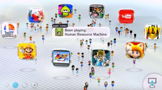
wii_u_miiverse_main_menu

So, last night, Nintendo pulled the plug on its Miiverse social network. This means I just lost a convenient method to take screenshots of Wii U games. Not only that, I also lost the only method I had to take screenshots of the video feed on the Wii U Gamepad.* I hope the screenshots I’ve saved so far are enough to illustrate any future writing!

Of course, we could ask why players ever needed to connect to a social network to take screenshots of a game in the first place. (Certainly, the ever-reliable twelve seconds required to reach the Miiverse servers was never welcome.)

But, in honor of its passing, let’s cut the Miiverse some slack. The Wii U was, after all, the first console to launch with a built-in screenshot taking mechanism, catching up to Steam’s well-worn “F12” key. And it remained, up until last night, admirably responsive. Despite the network-induced downtime, you were still guaranteed to capture the exact frame up on the screen when your thumb hit the “home” button, with none of the guesswork-inducing delay of the PlayStation 4’s “share” function.

That’s not the only feature the Wii U sported that was demonstrably superior to those of its competitors. It gave the world the first web browser for a home console that didn’t completely suck. To this day, I still curse the Steam and PS4 browsers for not auto-filling your browser search bar with the game you have suspended, a cherished Wii U feature. And the notion that strategy tips posted on Miiverse would transform every game on the console into a pseudo Souls-like was intriguing, even if never got implemented beyond a few choice first-party titles like Super Mario 3D World.

Ah, and now I’m getting all misty-eyed. I missed a prime moment to post a retrospective on the Wii U console, back in March when the Switch launched. But the Miiverse’s death seems like a worthy milestone, so let’s commemorate.

Continue reading

Less Efficient Means

less_efficient_means_post_header_image

In The Grasshopper: Games, Life and Utopia, Bernard Suits offers the following definition of a game:

[T]o play a game is to engage in activity directed towards bringing about a specific state of affairs, using only means permitted by rules, where the rules prohibit more efficient in favour of less efficient means, and where such rules are accepted just because they make possible such activity.[i]

What does Suits mean by the favoring of “less efficient means“? Well, we could imagine a reductio ad absurdum version of any given game, in which players truly want nothing more than to achieve the game’s end goal. Suits offers this famous description of golf: “if my end were simply to get a ball into a number of holes in the ground, I would not be likely to use a golf club in order to achieve it, nor would I stand at a considerable distance from each hole.”[ii] Of course, the real goal of golf is not to get a ball into holes in the ground. The real goal of golf is to be good at … well, golfing. This leads Suits to his pithiest formulation: “playing a game is the voluntary attempt to overcome unnecessary obstacles.”[iii] Games aren’t really about their purported end goals. They are about consenting to manufactured inefficiencies, accepted as the constraints that make play possible.

One means of introducing “less efficient means” into the completion of a task is by using deliberately abstruse user-experience design. We see this in analog game design in classic party games like Twister or Operation. We see this in digital game design in the fumblecore genre, which I have written about before.

Today, I’ll be writing about two games, both of which harness deliberately inefficient control schemes as a key component of user experience: Affordable Space Adventures (KnapNok Games, 2015) and Duskers (Misfits Attic, 2016). Neither precisely qualifies as “fumblecore” (at least according to my own definition), as neither involves the control of a human body. Instead, both games task players with piloting spacefaring vessels, using a technologically-aided science-fiction setup to justify their cumbersome controls.

Despite this congruence in abstract terms, you’d be hard pressed to find two games more tonally divergent, which made pairing them together even more irresistible.
Continue reading

Double Blind

perception_screenshot_01.jpg

Ian here—

I’ve written about synesthetic interfaces before: that is, interfaces that perform a sensory substitution, translating the information normally associated with one sense modality into the phenomenal forms normally associated with another. In my previous work, I’ve usually focused on forms of nonhuman perception and certain modes of perceptual expertise. The release of Perception (The Deep End Games, 2017) yesterday, however, gives me an opportunity to dip into a new topic: disability.

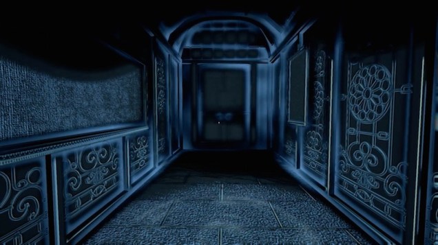
Perception is a horror game about a blind woman exploring a haunted house. Unlike a game such as Papa Sangre (Somethin’ Else, 2010), however—an experiment in audio-only digital game design that has sadly been taken off of the iOS App Store as of this writing—Perception doesn’t court blind and other low-vision players. Rather than featuring robust, binaural sound localization simulation, Perception re-imagines the auditory perception of its blind protagonist Cassie as a kind of sonar vision, thrown up on the player’s screen in spooky, warbly monochrome.

This isn’t the first time games nominally about blindness have been served up to sighted players. In this post, I take up a comparative investigation of Perception alongside Beyond Eyes (Tiger and Squid / Team17 Digital Ltd, 2015), which drops the horror angle in favor of child-friendly, colorful adventure.

Continue reading

Personal Puzzles

sym_screenshot_header_image.jpg

Ian here—

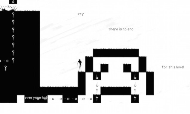
When you first start playing Eli Piilonen’s The Company of Myself (2DArray, 2009), it feels as if someone found a way to perfectly weld together a diary entry with a puzzle platformer. This was back in the heady days in the wake of Jonathan Blow’s Braid (Number None, 2008), when the public at large was still reeling over the idea that puzzle mechanics could mean something. And, at first glance, The Company of Myself seems to take this trend and go somewhere quite confessional with it. Its central mechanic of cloning yourself to solve puzzles stood as a perfect expression of feelings of self-reliance. And not just any self-reliance, either, but rather that specifically incorrigible mode of self-reliance that emerges when one is a bit too much of an unreconstructed introvert, refusing even the most basic forms of assistance because you desperately wish to not bother, or to be bothered by, anybody.

The “cloning” mechanic has popped up elsewhere in games—for instance The Misadventures of P.B. Winterbottom (The Odd Gentleman, 2010)—but The Company of Myself was more ambitious, wedding the mechanic with a personal story of interior life. Or, at least, it seems to do this, until you realize the whole thing is bullshit. The story takes an eleventh-hour delve into the lurid, revealing itself as an over-the-top fiction, rather than a form of sincere self-expression on the part of its creator.

The Company of Myself takes the easy way out, tacking on an over-dramatic denouement that destroys its potential as a diary-game. But … what if it didn’t? Could one actually use puzzles to communicate the intricacies of internal lived experience, in an emotionally sincere way? In this entry, I’ll be looking at two games that try: Liz Ryerson’s intimate and beguiling Problem Attic (2013), and Atrax Media’s more slick and straightforward Sym (2015). Along the way, I’ll also be dipping a bit into Braid, just because it’s hard to talk about contemporary puzzle platformers without doing so.

Continue reading

Cursory Knoweldge

outlast-screenshot-01

Ian here—

If I had to sum up a significant portion of the writing I do on videogames, I would offer the following formulation as a précis: The establishment of character in videogames isn’t achieved solely through writing. It is also established through user interface design.

Sometimes, something as simple as how a cursor behaves can tell us a lot about a character. Be forewarned—the breezy tour through the issue below contains significant spoilers for Firewatch (Campo Santo, 2016).

Continue reading

Interfacing Intuition, or, the GUIness of the Detective’s Gaze

minority-report-screenshot
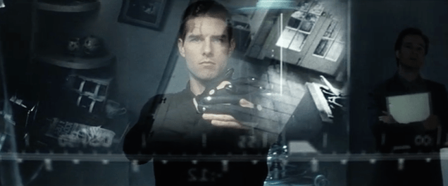
Minority Report (Steven Spielberg, 2002)

Ian here—

What follows is my talk from SCMS 2016 in Atlanta, GA. You can follow along with the visual presentation here.

The moving image and the graphical user interface: they are often regarded as two separate forms, with their own unique histories, and with resulting divergent aesthetics. Recent years, however, have seen this division beginning to break down, as the GUI has gradually invaded moving-image storytelling.

Representations of the graphical user interface have a long history in science-fiction, from the augmented reality elements that clutter the cyborg’s point-of-view to the fantastic potentials of human-machine interfaces. Continue reading