Even those who would reject the idea that videogames are an “art form” could agree that games can exhibit certain traditional aesthetic values. One prominent one is elegance. If we look toward traditional, analogue games, it seems inarguable to me that Go is elegant, and that Chess is elegant. Over the course of centuries, the tumbler of human culture has worn them down to their most perfect, least messy forms. (And they often come in supremely visually pleasing packages, to boot.) Looking to the history of videogames, it seems uncontroversial to propose that Tetris (Alexey Pajitnov, 1984) and Breakout (Atari, 1972) also exhibit this serene mixture of simplicity and grace.
Of course, videogames can also be bloated and unrefined. On the audiovisual level, the public imagination has long associated the medium all that is cacophonous and retina-searing: a ceaseless stream of crude stimulation optimized for goldfish-like attention spans. A peek at the output of PlatinumGames or Treasure over the past decade demonstrates that this conception is not entirely unearned. On the design side of things, games often come packaged with an inordinate amount of mechanical cruft. To boot up a contemporary Ubisoft game is to be assaulted by map icons, as the core activities of the game are augmented with collectibles and minigames and side-challenges and online player “invasions” and microtransactions and and and and and and and and and….
Sometimes, though, you can point to a game and say, “this is exactly what it needs to be, and no more.” Sometime a game stands as a perfectly-cut gem of craft, with every element contributing to an overall sense of balance. Its user interface is a triumph of usability, compact and graceful. Its color scheme is tamped-down and meaningful. Its sound design is minimal and expertly-deployed. It is thematically tight: if there is a narrative involved, it is a lean and coherent one. It is, overall, soothing in its form, even if it might simultaneously be stressful in its challenge.
The first five games of this list all chase this sort of technical perfection. Some are small, and some are large, but they all are careful not to hit one unnecessary note.

Portal
Developer: Valve Corporation
Released: 2007
Platforms: Windows, Mac, Linux, PlayStation 3, Xbox 360, Xbox One (via Xbox 360 backwards compatibility)
So, no surprises here. I’ve put this list together to honor the tenth anniversary of Portal, so I might as well lead with it.
I booted up Portal recently to take some screenshots. I have played through it many times, but it had been years, now, since I had last brought it up. And, within minutes of booting it, I was laughing aloud. The writing was as sharp as ever, and Ellen MacLain’s vocal delivery as GLaDOS (and, well, pretty much every other robot) is still pitch-perfect. That, to me, is the mark of good comedy: something that can still make you laugh even when you’re a decade older than when you first encountered it.
To just praise the comedy of Portal, though, would be a great disservice. Almost every one of its details is striking in its precision.
Take the sound design. Half-Life 2 (2004) had already cemented Valve’s place as having some of the best sound design in the industry, and, from its menus to its portal gun, the sound effects of Portal follow in the lineage of the previous game’s chirrups and hums. But Portal jettisons the sometimes uninspired funky breaks-laden score of the Half-Life series in favor of a suite of ambient drones. The game’s score hangs so perfectly in the background that it could easily be mistaken for sound of air circulating through these deserted test chambers. This innocuousness is the score’s secret weapon. Throughout most of the game, it is calming, but every so often just enough soft dissonance erupts to inject a sense of vague menace into the proceedings. Mood-setting without giving the game’s story beats away, it is a genuinely great feat of scoring, and one that is completely integrated with the game’s sound effects.
Then there is the color scheme. It is full of gray, but nonetheless never boring, because those shades of gray are just so damn meaningful. You learn to read these rooms at a glance. A wall being just the wrong shade of gray can prompt a grimace of frustration, as you instantly realize that it means you can’t place a portal where you want. What by all rights should be a dreary visual experience becomes a rich and intoxicating one, simply because these surfaces are all so communicative.
I could go on. I could praise the game’s short length, the fact that it basically consists of the longest and best tutorial that games have ever known. I could praise the intuitiveness of its far-fetched physics system. I could praise its svelte environmental storytelling. Instead, though, I will follow Portal‘s own lead, and keep things short and sweet here.
After all, we have a lot of ground to cover.

The Witness
Developer: Thekla, Inc.
Released: 2016
Platforms: Windows, Mac, PlayStation 4, Xbox One, iOS
Aha! A fake-out!
Because I lead with Portal, you assumed that the other four games I mentioned in my introductory post—Passage, The Graveyard, Braid, and World of Goo—would be on here as well, didn’t you? Well, that’s not going to be the case. I made a quick note on the historical importance of those games to the indie game/art game scene of the past decade primarily because I didn’t want to have to mention them again. In the case of three of those games, I have chosen a different, more recent game to represent the developer’s output. And the developer of one of those games doesn’t even appear on this list.
And so: Jonathan Blow’s Braid is not on here. And the reason is simple: Braid is pretentious. I don’t mean this as a juvenile dig. I mean it quite literally. I will lean on the OED definition here: “Attempting to impress by affecting greater importance or merit than is actually possessed; making an exaggerated outward display; ostentatious, showy.” Braid has some robust, rich themes, to be sure, but these themes are lathered in an ostentatious and showy display that leans on vagueness and allusion to make its (already meritorious!) themes seem more earth-shaking than they actually are.
Braid is about how, for nominally future-directed creatures, we spend a great deal of our lives in the past, lost in our memories. Sometimes, we re-play scenarios, wishing we could have known then what we know now. Other times, we want to un-know things, unburden ourselves of knowledge that has destroyed our sense of the world and our relationship to others. In our aspirations and our regrets, our Janus-faced peering forward and back, our psychology mirrors the physics of time, which is only really uni-directional in conventional Newtonian physics, and behaves in more interesting ways on a quantum level.
See? I just explained Braid. It took less than 100 words. These are rich ideas! But the way in which Blow expresses these ideas in Braid is ostentatious, belabored, and ultimately scattershot. In addition to its mechanics, there are mounds of purple prose. Its climax revolves around toxic male behavior, and Blow’s reaction to people’s interpretations have underlined the sloppiness of this inclusion, as Blow seems utterly unprepared for the discussion of gender the game prompted. Braid also uses the creation of the atomic bomb as a metaphor, which seems like something that should get you thrown in metaphor jail.
Anyway, I’ve now spent three paragraphs explaining why I didn’t include Braid on this list. It is time to explain why I did include Jonathan Blow’s second game, The Witness—quite happily, in fact.
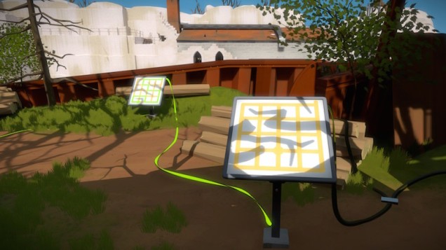
The Witness is thematically tight in ways that Braid is not. The Witness is about observation, belief, and wonderment. The game’s choice quotations from scientists and theologians suggest that, despite the divisions that have opened up between these two endeavors since the 16th century, they are each animated by the intermixture of these three human capacities. Following the lead of John Brockman, Blow charts a “third culture” approach, holding both material and metaphysical investigations to the same rigorous standards of intellectual honesty, and celebrating both as potential outlets for humanity’s best qualities. The game’s puzzles themselves are based around a pedagogy of scientific refinement: of observing, of revising deficient beliefs, and in so doing becoming closer to the truth of the world, in all of its wondrous mysteries. The Witness is a paean to the human intellect and to human curiosity, built upon the conviction that a puzzle game is the best vehicle to praise these particular faculties. This could hardly be called a modest aim. But I don’t consider it to be a pretentious one. The Witness lays itself bare, allowing use to judge the merits of its themes as we see fit. It is a straightforward treatise on old-school humanism in videogame form: no more, no less.
The Witness is elegant in its thematic precision. It is also elegant in its design—although it does not seem to be, at first. The game’s puzzles stand on their own, and, at first glance, it seems massively unnecessary for them to be placed on monitors within an elaborately rendered three-dimensional landscape. But, gradually, the purpose of this landscape reveals itself to be tightly integrated with the game’s puzzle design. It starts with small and overt moments: a shadow here, an apple dangling from a tree branch there—clever environmental clues to puzzle solutions. But then, gradually, the “Tetris effect” sets in. You begin seeing the patterns of these puzzles everywhere. And unlike when you see tetrominoes falling when you’re walking down a real-life street, the world of The Witness actually rewards this psychological propensity. This is not ersatz pattern recognition. This world has been built from the ground up to reward your ability to see puzzles everywhere. This expansive, quiet island is positively claustrophobic in its thick application of puzzle logic.
Jonathan Blow is a very serious man who makes very serious games. Sometimes, his pretensions get the better of him. But if he produces anything as beautifully elegant as The Witness again in his career, we should all count ourselves lucky. A gem of the decade.

LIM
Developer: merritt kopas
Released: 2012
Platforms: Browser-based HTML5 (here)
Since 2012, we’ve been experiencing a real queer games renaissance. Porpentine, Christine Love, merritt kopas, Mattie Brice, Robert Yang, Nicole Brauer, Dietrich Squinkifer, Maddox Pratt, Llaura Dreamfeel, and Liz Ryerson have all made major works in the past five years. But towering above them all is Anna Anthropy’s Dys4ia (2012). I swear, no screenshot from any game has made so many appearances on so many slides at so many conferences as that “I feel weird about my body” screen from Dys4ia. You know the one I mean. (And, if you don’t, you can easily Google it.)
So, of course, you would expect a spot on this list to be reserved for Dys4ia. How could there not be? It’s one of the most talked-about games of the past decade. Surely, it must make an appearance. So, let me just remove the red velvet “reserved VIP” rope from its designated spot, and direct it into its seat, and …
… nope. Not here. Not now. I’m going to be coy about whether Dys4ia will eventually show up on this list, at all. But I knew I wanted to avoid the logic of “one designated queer game per best-of list.” So, up for today, instead: LIM.
To be perfectly frank, I suspect that LIM will age the best out of all of these early games of what is hopefully a long-term queer games movement. And that’s not just because it’s made in HTML5, rather than Flash or RGP Maker. It is because it is elegant.
LIM takes the diaristic impulse of so many of the above-mentioned maker’s games and filters it through a heavy layer of abstraction. The end result is a simple, and I daresay perfect, digital fable.
LIM is a game about disempowerment, about the ways in which movement is restricted for marginalized bodies. But unlike Brice’s Mainichi (2012), or something like Jordan Magnusson’s Freedom Bridge (2010), this disempowerment isn’t wielded as a cudgel, didactically taunting us with unachievable goals. LIM does not simply succeed as a parable. It also succeeds as a game. It is a stressful game, to be sure, and one that is not entirely pleasant to play. But it can be played, and it can be won. Winning is difficult (to the point where the game feels a little broken—something that stands as the only blemish on its otherwise perfect form). But it is immensely rewarding, and actually helps to cement the game’s message: that hiding who you really are is a suffocating experience, the pain of which rivals the pain of the outright violence you might encounter if you dropped the façade.
So, yes: Dys4ia is great. And it was necessary. But its default position shouldn’t be to monolithically overshadow other great games. LIM is a game of the decade. I stand fast in this assertion.
Super Mario Maker
Developer: Nintendo EAD Group No. 4
Released: 2015
Platforms: Wii U
Just about since the birth of the world wide web, there have been games whose popularity is built upon the strength of user-generated content. Tim Sweeny encouraged players to create their own worlds using the editor function of ZZT (Potomac Computer Systems, 1991), re-releasing his hand-picked favorites. The low-footprint WAD files of DOOM (id Software, 1993) allowed mods to spread far and wide. The internal storage and internet connections of seventh-generation consoles allowed the possibilities of user-generated content to expand beyond PC games. Media Molecule’s LittleBigPlanet franchise debuted on the PlayStation 3 in 2008, built around a core of level creator tools that expanded with each sequel. In 2009, Nintendo entered the fray, with the release of WarioWare D.I.Y. (Intelligent Systems / Nintendo SPD) for its handheld DS system.
So the idea of game built around user-generated content is anything but a novel one. This doesn’t, though, cheapen the immense achievement of Super Mario Maker. Super Mario Maker towers above its competition, for two reasons.
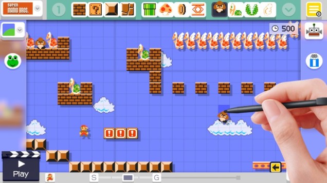
One is the ease of which it places new user-generated experiences at your fingertips. The “100 Mario Challenge” feature is a brilliant feature: a user-friendly deep dive into user-generated content, tuned to maximize discoverability. It reduces the stress of specifically seeking other creators out, letting you instead immerse yourself in a flood of startling creativity. Chaining the feature to unlockable costumes that can be used in your own level design is also a wonderful touch, as it provides just the right amount of extrinsic reward for wading into the work of your fellow creators. In short, Nintendo took the act of exploring user-generated content and made a game out of it, one with its own challenges, strategies, and well-paced rewards.
Then there is the user interface for the game’s level designer, which is nothing short of masterful. For years, Nintendo has been honing the art of perfectly delightful user interfaces. They gave us the dulcet ambient chimes of the Wii main menu. The inexplicably satisfying Mario coin “loading bar” of the Wii Shop Channel. The infectious theme songs of the Mii Maker and 3DS Mii Plaza. Super Mario Maker‘s level editor is the culmination of this long stream of delights. It is easy and intuitive, yes: these are absolutely crucial components of its success. But it goes the extra mile by also being a joy to use. The first time you drag and drop an element onto the grid and witness the interface actually singing to you, I dare you not to smile.
And, as it turns out, a stylus is perfectly suited for editing Mario levels. Super Mario Maker really needed to be a Wii U launch title: No other game in the console’s entire library makes such a compelling and effortless case for the hardware’s odd form factor. This is the game that could have sold the Wii U Gamepad, and saved the entire endeavor of second-screen gaming. Alas, it was not to be. But now that Nintendo has retired the Wii U, I dearly hope that they can find a way to approximate this experience on future hardware. It was a boon to creative engagement, and it would be a shame to see it consigned to the dustbin of history.
Minecraft
Developer: Mojang Specifications
Released: Early alpha versions available for download since 2009; full commercial release 2011
Platforms: It would take too much space to list them all here, so I’ll just say “everything.” (Seriously: it is quickly becoming one of the most ubiquitous games ever made.)
Between June 30, 2010, the moment creator Markus ‘Notch’ Persson released the first version of Minecraft he asked people to pay for (Alpha 1.0.0), and November 18, 2011, the date that the “full” version of Minecraft was “officially” released, the game went through 76 discrete, official numbered versions. Each one of these was pushed to players as an update, with each update bringing new flora, new fauna, new landscapes, new mechanics, and new possibilities. Since Minecraft‘s “official” full commercial release, it has continued to receive numerous major updates, re-tooling its combat, adding new monsters and allies, and overhauling both its world generation algorithm and lighting system.
Based on these numbers, Minecraft seems to be the very poster child of feature creep in videogames. With everything that has been added over the years, both before and after its official “release,” surely Minecraft must, at this point, be sprawling and unfocused. Surely, as historically important as the game is, reaching unprecedented levels of ubiquity among children worldwide, it has no place being listed under the category of elegance.
And yet … listen. Do you hear that?
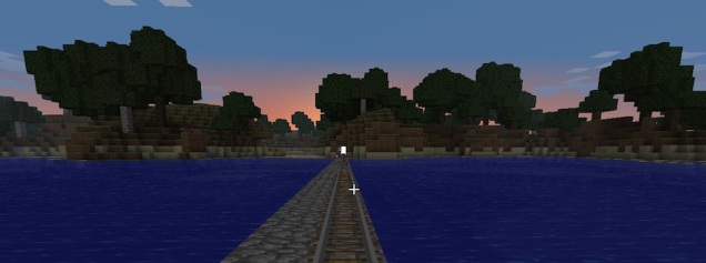
That’s the tap tap tap of a pickaxe against a stone block. It’s not a harsh sound. It is a soothing sound, like someone patting a pillow made of soft clay. Five taps, and the block bursts. Such a perfectly paced little loop of tension and reward. And then you upgrade from a wooden pickaxe to a stone pickaxe, and the time to break the stone is shorter. And then you upgrade to a metal pickaxe. And then a diamond one. Each time, the number of taps required to break the stone grows smaller. But it’s always the same taps, the same soothing sound, lulling you into the same Zen-like state of conversation.
Those are the cold synth tones of Daniel Rosenfield’s score. Wispy and reverberating, it sounds like it’s coming from somewhere far away, and yet every time you hear it, you feel more at home. Ah, there it is again. Marking the hours of the day, a non-diegetic grandfather clock. Time to pack things in. The sun is going down. Lost myself in the work a little, there.
That is the bleating of sheep on the surface. I have foolishly gotten lost in the inky darkness of a cave without a set of torches. For a few minutes, I was terrified. But now, I hear them: the old, familiar animal sounds. My re-entrance into the world is nigh. All I have to do is break a few more blocks, following the sound of those pastoral creatures …
I won’t deny that feature creep has infected Minecraft over the years. It cannot be the lean, chiseled slice of perfection that it once was. But there is no taking away that core: the minimalist visual design, the careful audio feedback, the haunting score. Minecraft just feels good to play. I suspect it always will.
