Get a Clue: Clues and Obra Dinn

group project submission, created by group co-leader Albert
University of Chicago MADD 25630: Games, Rules, Stories, Genres
Spring 2020

“The contradiction? Elementary.” I say, before submitting every possible piece of evidence from the court record in a pathetic attempt to convince Ace Attorney I’ve been paying attention.

The difference between the puzzle of a traditional detective story, and the puzzle of a game floating loosely in that genre, is fundamentally set around the question of the audience’s relationship to the method of solution; the clue. In the traditional form of the puzzling story, the primary work expected of the audience is in interpretation. This is of course, because the story medium doesn’t allow the reader to discover things on their own. You can never truly see the scene of the crime as Holmes does.

Obra Dinn reverses this work. In the case of the gameified version of detection, the audience’s primary work is in that mechanism of discovery. The primary job of the player is to collect the information. Booking everything together and naming the crew is simply the end result of that identification process.

At an abstract level, Obra Dinn breaks its clues into two categories: Ludic clues, and given clues. These categories relate to the way that the information is presented to the player. By ludic, I mean information presented in wholly diegetic ways. This information is not explicitly discretized and given to the player, but is instead observed within the world. In broad strokes, the still sequences and audio presented through the Memento Mortem are examples of ludic clues. It is the job of the player to sort through those sequences to extract meaningful information. On the other hand, the information filled into the log book that the player is able to reference are “given”. This kind of clue exists to contextualize the scene. In a way, these given clues are the scaffolding on which ludic clues are built.

In broad strokes, the form of clues in Obra Dinn can be split between the world as presented in first person to the player, and information as is discretized and presented through the logbook. Ludic clues then, can take any number of more abstract forms. The way one character refers to another, the directions they face, their clothing, and other physical traits are all things that can provide information that is meaningful towards the end goal of identifying the members of the crew. Given clues are information that could not be obtained by mere observation. The player only accesses this information because the game gives it to them. It’s interesting to note that these given clues are necessary to allow for deduction even in the traditional form of the genre. Sherlock Holmes knows the basic details of a crime scene when he walks into it, and similarly the logbook allows the player to know basic details of each scene they observe. There is then a certain level of information that is expected of the game that cannot reasonably be gleaned simply through exploration of the environment. A more explicit example of these givens are in the glossary at the back of the logbook. Because you are asked to step into the role of someone who presumably has an understanding of how a ship’s crew would be organized, there is an expectation that certain information, like what exactly a midshipman is, be provided.

Most of the given clues examined previously are of the type that could sit comfortably in a more traditional representation of the genre as well. There are however forms of given clues that are specific to the gameified version of the genre that Obra Dinn represents. When you’ve gathered enough information to identify a member of the crew, the image of their face will become visible in image. This change in state is itself a clue, as it provides a context for the information that’s already been gathered, drastically narrowing down the total number of possibilities. This information set is an artifact of the need to par down the amount of information that the player and audience can reasonably be expected to deal with.

As a personal aside, I think that it’s interesting that, given how easily accessible information like the sort provided in the glossary is, it would be possible to create a solvable deduction based game that lacks context clues. It certainly wouldn’t be fun to constantly cross reference the internet to find relevant information, but it would be interesting.

The clues in Obra Dinn also serve a very strong narrative purpose. Piecing together the circumstances of death for each person aboard the ship in turn pieces together the larger narrative of the events that occurred on and to the ship itself. The player is never taken aside and explained at, the progression of the narrative is instead a product and function of the core gameplay loop.

By offloading the detective work onto the audience, or in this case the player, Obra Dinn is also able to unload a majority of the fluffwork that occurs in more traditional forms of the genre. Obra Dinn doesn’t need an extraordinary Sherlock figure to create intrigue because it has the time and space it needs to create a compelling history for each of the sixty people on board. This is true in terms of the larger narrative as well. Each time the player puts a name and cause of death to a face, they take another step towards answering the question of what exactly happened on the Obra Dinn.

I’d like to turn a bit towards the readings. Much of the above abstraction is hinged lovingly on Haycraft’s Rules of the Game, namely in how the shift in medium applies to them. The systems of Obra Dinn ask the player to step into the role of the deductive protagonist, and by extension give the audience access to precisely the information set that is typically only accessible to actors within the fictional world of the case. This also necessarily changes the way that clues are revealed. The traditional detective, abiding by the rules, can only present information that is in some way relevant to the problem of the story. Rodell says that “a good clue, then, is one which does in fact point in the right direction, but which seems at first to point in the wrong direction.” This misdirection happens because the audience’s interpretation of the clue is very heavily a product of the musings and deductions of the actors in the worldspace of the fiction. Without the ability to personally check against the scene, those deductions and assumptions become fact.

By giving the player access to the environment, this concept of a good clue isn’t entirely removed, but is instead slightly twisted. Misdirection isn’t applied through mal-deduction, but through the fact that the person who now sits in the deductive role probably doesn’t solve crimes for a living. In Obra Dinn, as has been stated, there is now the additional work of determining what information is meaningful, ergo a clue, and what information isn’t. In this case, the good clue is one that is hidden comfortably alongside other deductive noise.

As a final, tangential name drop (and space filler), I’d like to offer an opinion, that the form of clues in an interactive space is what allows the interactive, gameified version of the genre to transcend other traditional forms. Callois’ conception of the detective story as a game is harried by the fact of the distance traditional mediums put between their audience and their worlds. The clue is, in the traditional medium, a function of the cleverness of the plot. It is a challenge and puzzle to the reader, sure, but the readers job is not to deduce the solution to the case, but to try and put together the deductions presented by the plot before having it revealed to them. Obra Dinn reverses this. The player is the intellectual foundation of Obra Dinn, and the source from which clues and information stem. The traditional form of work purported by the detective story still exists, but it is layered on top of another subset of puzzling labor. While the reader is given the information they need to solve the case, the player is asked to first find the relevant clues on their own, and then piece those clues together.

To come back to the original topic, the function of clues in Obra Dinn is the same as any other form of the deductive narrative. Clues exist to piece together other forms of information, either a final conclusion or another clue. What is interesting then, is the form that clues take in Obra Dinn. Rather than points of intrigued marked by a third party, be it detective or say a button prompt, they take the form of physical information that the player must observe, sense, and interpret, taking on the role of the deductive protagonist who searches for information rather than backseating a godlike deductive figure a la Sherlock Holmes.

Final unrelated point, it was very clever of Lucas Pope to make us work in threes. Made it significantly harder for me to just guess things and I really didn’t appreciate it.

I hope next Lucas Pope makes a game where you have to do taxes.
The Expiration of Time and Love: Analyzing Speed of Motion in Wong Kar-Wai’s Chungking Express

intro

by Meagan, Emily, Dylan, Joalda, and Haina
University of Chicago CMST 10100, Intro to Film
Spring 2020

California Dreamin’-The Mama’s and the Papa’s (to supplement your reading)

The Chase

The context in which Wong Kar-Wai actually made Chungking Express is interesting to note as it relates to the techniques he uses to alter speed of motion in the film. According to Quentin Tarantino, Wong Kar-Wai was actually working on a different/epic movie, he had been editing for multiple years but had felt stalled in the process. Just as a writer needs to take breaks at times to look at their work with an objective lense, he felt he needed to step away for a bit, and decided to use the time to put out a quickly produced / quick hitting film, which would become Chungking Express. The context in which he made the film – moving from editing a film that was long, slower paced in time, to producing a film that was quick paced in time, and then returning back to the slower paced one – is in various ways actually reflected in his treatment of time in Chungking Express. As the remainder of this post will discuss in different ways, Wong Kar-Wai manipulates time through film techniques that alter the speed of motion. This manipulation of time is not meaningless however, the ways in which he does so is to reflect how time moves differently for different characters/situations, connecting us closer to their stories– instilling empathy in many respects. While Hong Kong films, at least at the time, were known for their fast paced approach, Wong Kar-Wai created a film in Chungking Express that is both fast and slow. And perhaps, his approach and reason to this was in-part to reflect how he perceives time as moving at different speeds within his own career.

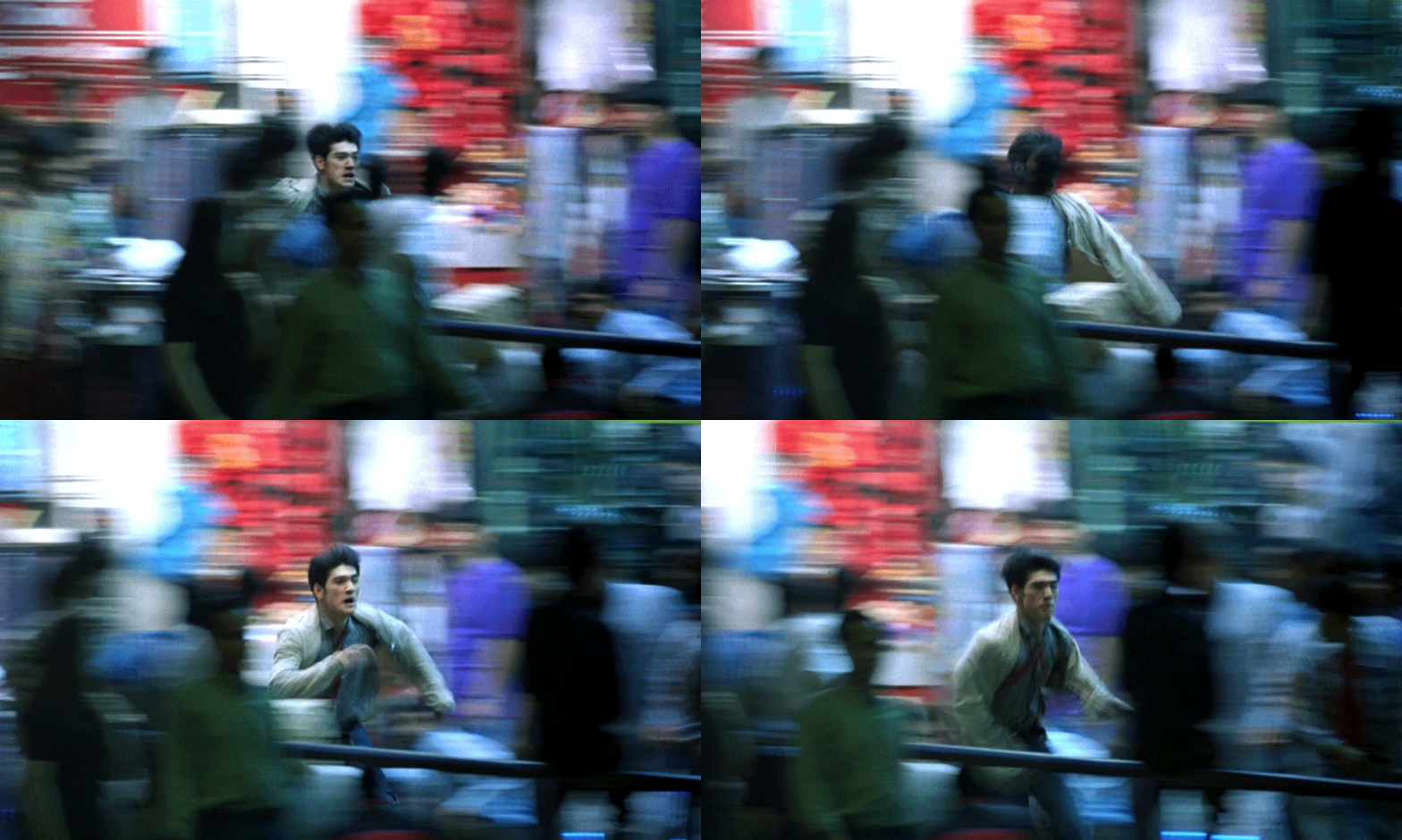
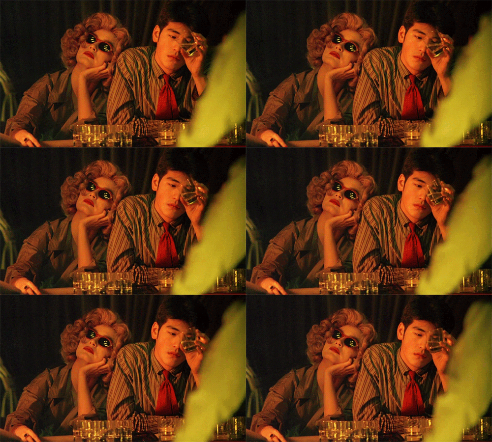
Step-printing uses an optical printer to repeat frames, so that in the end, the scene kind of looks like a flip-book. The process, more simply, is basically the duplication of a film frame, creating an interesting type of motion that is hard to define without visuals, but easy to recognize when you see it. In the opening scene of Chungking Express, when Cop 223 is running after a suspect, he is in focus, but the background isn’t, which makes his background look like a blurry string of neon lights behind/around him. The visual effect places him clearly in the scene, but also removes him from it, as the background is blurry and almost seems as though he is not entirely in the same place as the background. The scene is not in slow-motion or fast-motion, but a kind of different motion that is slow and fast at the same time. The step-printing effect aids in both the film’s illusion of time and feeling of isolation. The constant stream of neon lights, the hussle and bussle of the market (never failing to unveil the seedy undergrounds of the city), and the crowd of people is a common sight in Hong Kong food markets, yet Cop 223 is facing two struggles. One, his affinity towards true love has backfired. His love has ended their relationship and the second part of the movie shows Cop 223’s fight to stop the expiration of love and time. In a dream-like performance, Cop 223 wonders the city hoping his ex-girlfriend will chalk their break up to a practical joke. When he realizes this is an impossible scenario, he searches through the city to find his next meaningful love, or at least to feel close to someone again: “ This was the closest we ever got. Just 0.01 of a centimeter between us.” 

chase

The Letter

In part two of the Chungking Express, Wong Kar-wai’s signature step-printing is back: fueled by the combination of slow motion, time-lapse, and motion blur in a single frame. Cop 663 is also faced with the betrayal of love, in this case from an airline stewardess. It is worth pointing out that part two of the film follows much slower, romantic sequencing in comparison to the first. Yet, the concentration of time that elapses when Faye presents the hand-written note to Cop 663 from his ex-girlfriend is just as listless as the feelings of romantic loss. Instead of seeing a physical change to Cop 663 in this time of mourning, the audience can reflect on how the cinematographers feel about both Faye and Cop 663. In this lapse, we can imagine Cop 663 reminiscing on the life he had with the airline stewardess for the last 5 years. Yet, we can also imagine Faye’s longing for the cop, along with the realization her newfound crush is still emotionally invested in his previous relationship. As twenty-two seconds of step-printing plays, only Faye and Cop 663 remain still, while the rest of the world turns. Although the specificities of the letter are never revealed to the audience, the moment of Cop 663’s acknowledgement of the letter allows for two scenarios: He won’t read it, thus the heartbreak will never be materialized OR he reads it and spirals into emotional pain. The movement between the characters, allowed by step-printing, creates noise in an otherwise silent scene. Time is both the killer of his relationship, while Faye sees time as the nourishment for her budding romance. The subtleties that underlie change is the ultimate heart of the film, and these scenes of step-printing appear to be a mockery of the situations we cannot control. 

the letter

The California Restaurant

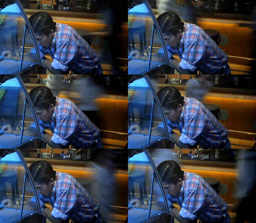
During one of the last scenes of part two of Chungking Express, we see Cop 663 in the California restaurant. After learning Faye’s secret, he decides to ask her out on a date and brings her to this restaurant that represents her dreams and aspirations. But time goes on, and Faye does not seem to be showing up. Wong Kar-wai’s use of step-printing is used to effectively communicate to viewers how Cop 663 is feeling. In this moment, it seems like he is separated from the world around him. As people go by him in the background, Cop 663 is slowly moving within the foreground. This can represent how time and the world around him is continuing even as he wallows in his sadness, waiting for his date to finally come and rescue him from it. The dialogue in these scenes also plays into his loneliness. He describes Faye’s lateness as a flight delay, and later says that the flight was cancelled, signaling that Faye would not be showing up. These descriptions tie into the fact that Cop 663 has yet to let go of his past where he is in love with a flight attendant, and can only seem to describe time and events through terms that can help remind him of the past. Even the music in the background, some sort of slow jazz, captures the slowness and dullness of the moment. The step-printing effect and the other crucial aspects of the film together create this somber tone that seems to continue to encompass Cop 663’s lonely life.

california restaurant

The Cup of Coffee

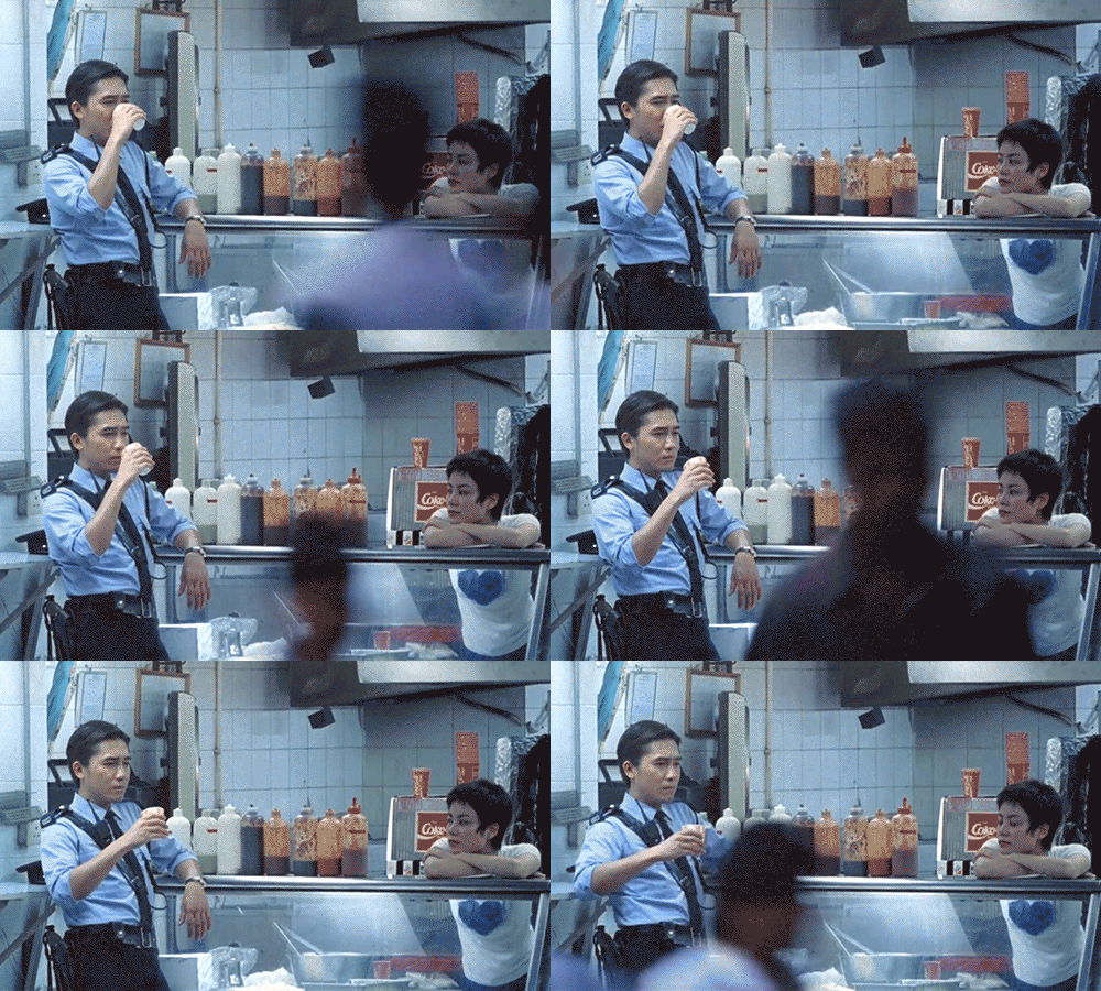
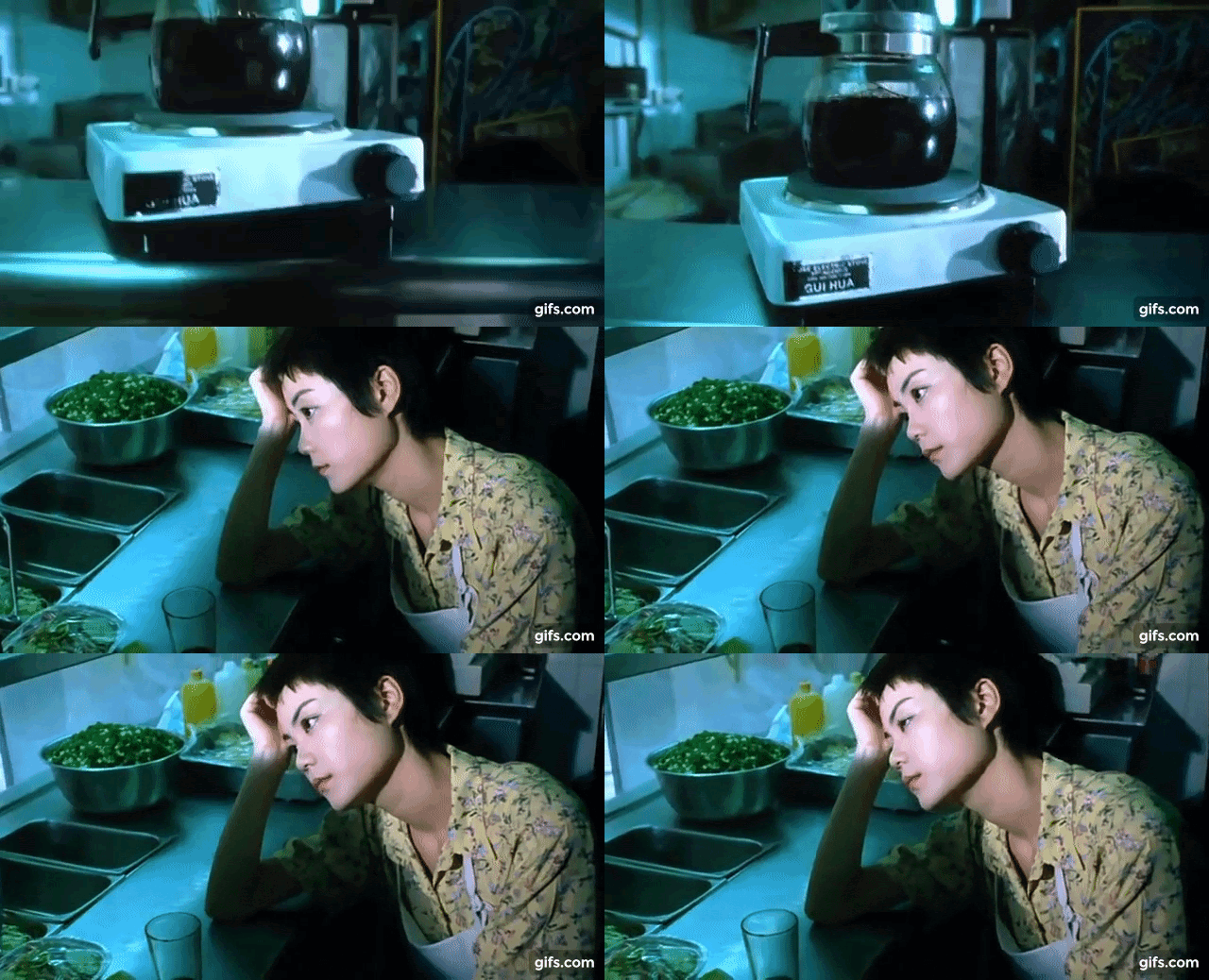
Faye offers Cop 663 her note after he tells the snack bar about his breakup; in a little over one minute, Wong uses the step-printing process twice to show the perspectives of both Faye and the heartbroken cop. For him, time slows down around him as he drinks his coffee; absorbed in his own residual feelings for his ex-girlfriend. He steps out of this trance as he leaves Faye and her letter behind, who returns to work diligently cleaning the counter at a normal pace. The scene then cuts to focus on a cup of coffee that Faye has brewed after her hours, and step-printing is used again to show her sipping the cup of coffee and grimacing at the flavor. Though there are no more people walking in and out of the frame, the intentional disjointedness of the step-printing process tells us that time is still passing outside, but moves slowly for Faye inside the shop as she tries to sort out her unrequited feelings. Unlike utilizing actual slow motion, step-printing allows for the manipulation of specific frames such that one can be drawn out for a different number of repetitions. Since it is also manually copied, viewers can tell when the placement or angle of the scene shifts slightly, such as in stop-motion films. Here, the shakiness of the transitions add to the cinematic effect in the ways the viewers can interpret and empathize with Faye’s feelings. Perhaps she is annoyed with herself for trying something she doesn’t like; perhaps she wishes to experience the same kind of feelings the cop is experiencing through solidarity; or perhaps she doesn’t understand what it is about coffee that he just enjoys so much. Most likely, she is feeling some combination of all of the above, and her disappointment at her predicament is clear. Placed directly after the other, the viewer experiences the emotional arrays of both characters who are isolated in their own worlds. As hard as Faye tries to empathize or place herself next to Cop 663, she struggles to step out of or make sense of her own emotions.

cup of coffee

A Look Into Parasite‘s Decor

making_of_parasite_-_publicity_-_splash_-2019

by Zach, Meagan, Dylan, Gabriela, and Alan
University of Chicago CMST 10100, Intro to Film
Spring 2020

Position of the Houses: How it Reflects a Class Struggle

Kim House

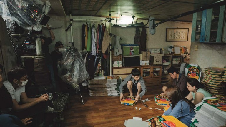
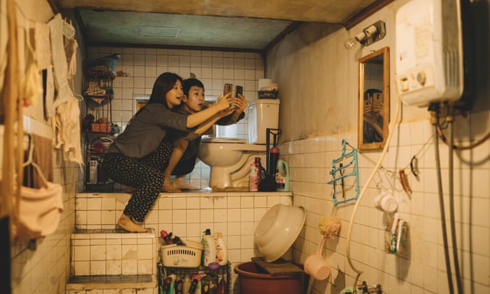
The Kim house is below ground in a busy and cluttered area of poor families with people disrespecting their home (including a couple of drunk men peeing on the property). Their house itself has very poor lighting and really the only pieces of technology are outdated, insufficient for their daily lives, and are in very bad shape. Their house has a very unorthodox structure to it, yet it can also be said that the Kims are very good at using what they have in order to make it work, regardless of the clutter that it creates in their home (E.g. socks drying on a ceiling fan and trying to latch onto any wifi possible). They have supplies for work (pizza boxes) stacked everywhere and store clutter in every room. Even the toilet is in a strange place, sitting on top of a ledge. There appears to be no beds in the home. In the opening scenes of the film, we see the patriarch of the Kim family resting his eyes and lying in a fetal position atop a thin rug. This layout shows how they manage to scrape by using what they have in the most efficient way possible. The family has this massive window that they have to look up to see out of. This could be a metaphor for the family wanting to climb up the socioeconomic ladder and take on a world that they don’t feel is theirs. On the outside of the window, it looks almost as if it is barred. This again shows how they are locked away from the rest of the world, unable to succeed and advance up the socioeconomic ladder. 

Park House

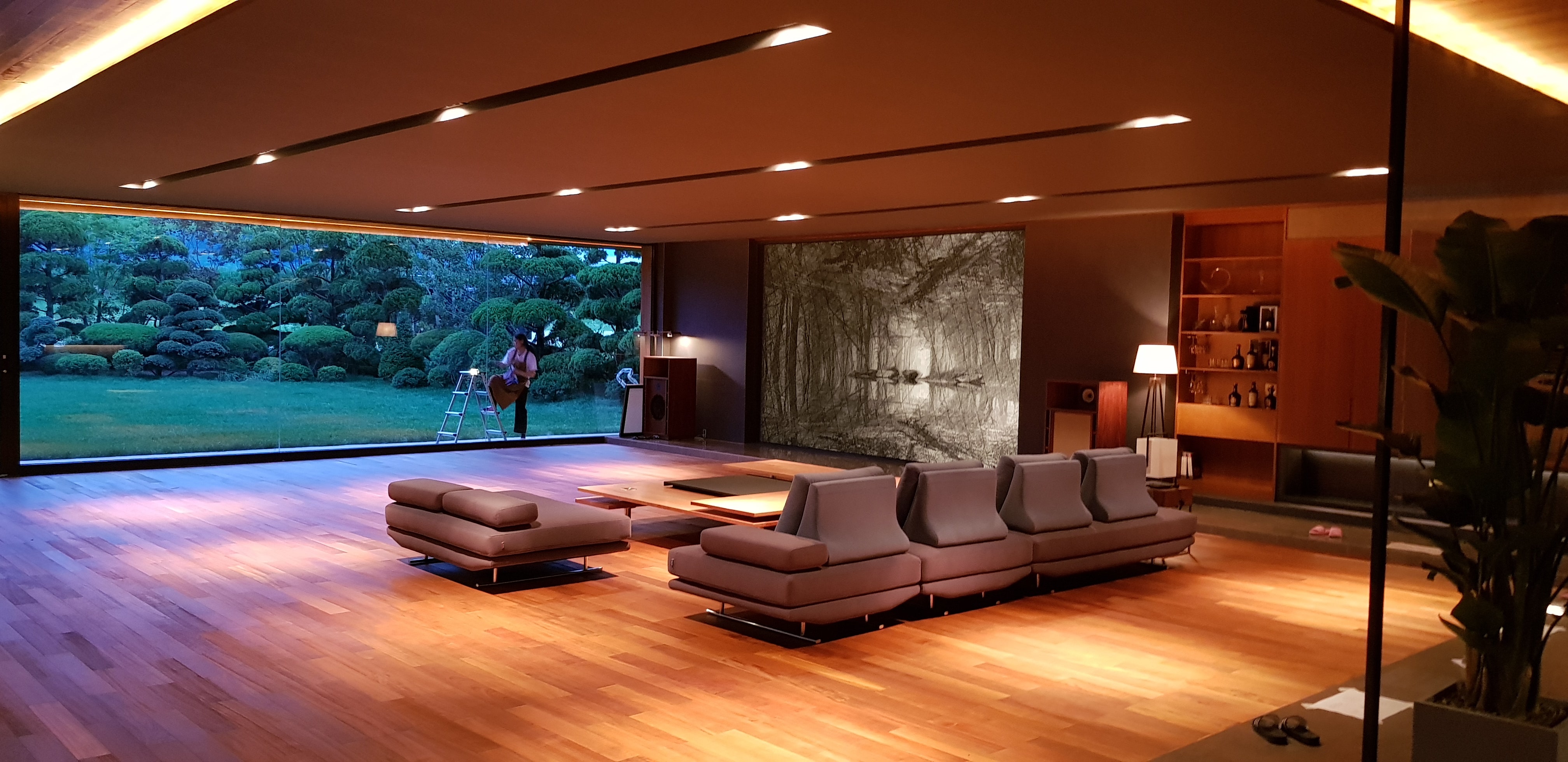
The Park house is everything that the Kim house isn’t. The Park house has a beautiful garden on its entrance and as the audience gets the initial shot of the property, it is obvious, even before it is mentioned, that the house itself is a work of art. The Park house is secluded on top of a massive hill, which saves it from being destroyed during the rain (the downfall of the Kim house because they are at the bottom where all the water heads). Instead of the clutter featured in the Kim house, their house is simple, clean, and modern. The house is both home-y and intimidating, but most importantly is an object of idealism. It is symbolic of success and excess, the antithesis of what is to come towards the end of the film. Unlike the Kim family who needs to make use of everything they have, the Park family has the space and luxury to keep their house clear of clutter. The family has many unneeded pieces of technology featured in their house including a television in the bathroom and a borderline iPad in the wall. Another big difference is that there is this massive window (as if it is a movie screen and the family is watching a movie out of it) that the family uses to look out into a beautiful array of trees and grass. A key difference here is that the family is looking out onto their property on equal ground, which could be a metaphor of that they are complacent on where they are in society on a socioeconomic level with the land that they own. Although the Park house and the Kim house are both isolated in a sense, the manner of isolation casts a very different light on their relation to society. The Kim house was pushed underground and seemed to trap the family, preventing them from reaching beyond their squalor. The Park house, on the other hand, uses beauty to isolate itself. They have created their own barrier to shield themselves from the unpleasantness of the lower classes in society.

a14ba6dccfe66fcd221e399032f5942673-parks-home-01-rendering.h467.w700

Stairs: A Motif for a Socioeconomic Climb

There is an emphasis on stairs in both the Kim and Park residences, a metaphorical device of climbing to wealth and significance. The set of stairs leading down to the Kim residence creates an effect of being subservient to the outside world, of being below even the drunken man who urinates on the street. The steps used to reach the toilet are filthy, yet it functions as the passageway to the tiny window (again, an entrance to the more ordered outside world). It forces the Kim family to constantly consider their place in society and to become parasitic beings. In the Park residence, stairs are a common motif of the home’s elaborate architecture. They even seem to function as a mode of communication between the Parks, Kims, and Moon-gwang and husband. Between the delicately placed champagne flutes and decorative fine china, something a lot less sophisticated is found deep in the basement. Even when the Kim’s son seizes in horror to the sight of Oh Geun-sae peering from the base of the stairs, the audience seems a glimpse of the calamity that will ensue when social classes intersect. 

1800

Intentions/Objectives: Decisions Made by the Production Design Team

It’s interesting to note that both houses were built from “scratch” by production designer Lee Ha Jun. For the Kim’s house, the set designers and production staff travelled to basement neighborhoods and used silicon modeling to replicate the environment, such as power lines and bricks. Jun says, “Nonetheless, we wanted to avoid having it [the houses] look like a set. We thought of the space as another actor. I told the art and set department that instead of trying to build Kitaek’s semi-basement neighborhood, we should just bring it over”. Jun also mentioned that once they started actually creating the Kim home, some of their dimensions – for doorways for example – were ‘off’, and so they had to makeshift props to retroactively fit the space. He mentioned that this ended up being a positive as many of these lower socioeconomic neighborhoods undergo the same process… that is, many years of iterative “fixes” to broken walls, doors, appliances, etc. He also mentioned that the small bathroom was modeled off his own experiences in college of having a moldy/overcrowded one.

While in the film it is mentioned that the Park family’s house was built by a famous architect, that is of course not the actual case. Jun states that while they wanted to build a house with custom furniture that made you feel like it was not only a real one, but also belonged to a wealthy family, he more importantly clarified that his number one priority was to create the home keeping in mind spatial relationships and camera angles they’d need that would be conducive to the plot – such as characters watching each other – as well as “blocking” (which the third group may speak more about). Aside from that, to accomplish the realness effect (that of an affluent family’s home), Jun actually included real art works such as the image of a forest made by Korean artist Seung-mo Park (see below). Jun says that this artwork was intended to serve as a status symbol. 

maya_afternoon

The Park families wealth is also demonstrated towards the beginning of the movie when the house is first being shown to Kevin. The mother of the Park family stops to show Kevin the family’s photos that have been hung on a wall of the house. The photos consist of some family portraits as well as wedding photos and impressive accomplishments that the father of the Park family has achieved. This pocket of photos displays the Park family’s wealth by showing that they are able to fund these photos and most likely have hired professional photographers to take them. The photos also show the career accomplishments of the father of the Park family that alludes to his major company that has become successful, as shown in the magazine cover that has been framed on the wall. In addition, in the photos the family is all matching wearing fancy clothes. This is especially prominent in the wedding photo, as the mother of the Park family is wearing a beautiful wedding gown with a long train. Wedding gowns to begin with are already very expensive, but the glamour of the mother’s wedding gown shows that it would not be something that many families would be able to afford. 

Animation as a Tool for Expression: Examining the Original and Live Action Lion King

By Charlie Donnelly

Prominent film theorists and filmmakers disagree about the role of animation in cinema, with the philosopher Stanley Cavell claiming that “cartoons are not movies” (Frank 24), a stark contrast with educator Hannah Frank’s conjecture that “all works of celluloid animation [are] photographic in origin” (Frank 23). While we’ve discussed the role of animation in cinema in class with varying opinions, there are certainly instances when animation possesses an expressive quality lacking in traditional photographic cinema, especially seen in the differences between the original 1994 animated version of The Lion King and the 2019 live action remake. Although some feel that live action possesses the most varied capabilities as a mode of cinema, I will argue that animation has unique powers of expression in creating vivid and recognizable characters, establishing connotation and theme, as well as creating heavily stylized worlds with their own distinct visual iconography.

Continue reading →

Inside Bresson’s Truth – Cinematic Life In A Man Escaped (1956)

hero_EB20111121REVIEWS08111129995AR

by Ben Ratchford

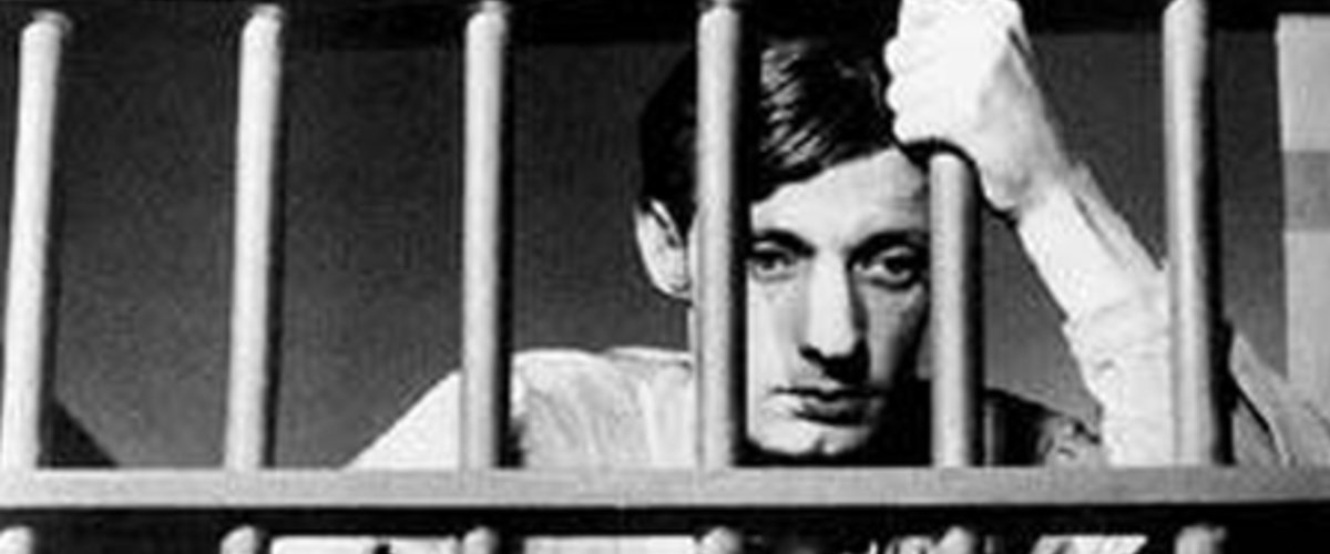
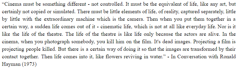
It is often said of Bresson that his films, through their mechanical nature, their minimalist approach to their presentation of human emotion and experience, portray more passion and depth than could be achieved by “showier” directors. Bresson  expresses this as one of his goals in filmmaking in an interview from 1973.

BressonQuote

Continue reading →

Color in Spider-man: Into the Spiderverse

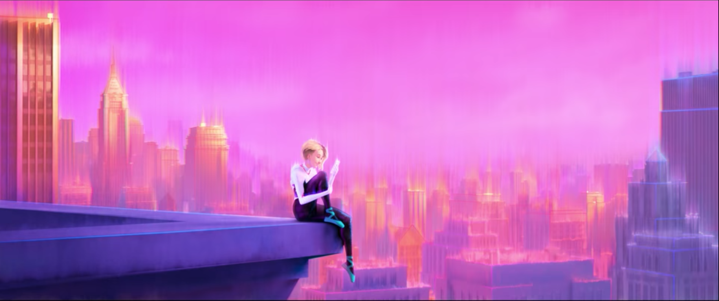
Screen Shot 2019-12-12 at 7.59.40 PM

by Nick Nowicki

Spiderman: Into the Spiderverse is a superhero film that tries to emulate the experience of reading a superhero comic book. The film moves away from the live-action superhero paradigm and fills the screen with bold colors, halftoned graphics, and word-boxes that one would see in the comics. Color in particular plays a variety of roles in establishing character traits and developments throughout the film. This post analyzes three main uses of color in the film. First, I will examine how color is used to establish good and evil figures in the film. Next, I will focus on how color is used to emphasize the emotions of characters and the overall tone of a scene. Finally, I analyze the role that color plays in signifying turning points in the narrative arc and various character arcs.

Background on Comic Book Color

Four colors serve as the basis for most of the colors we see in early comic book prints and Into the Spiderverse: cyan, magenta, yellow, and black. The CMYK color model (K being a “key” color, black) stands in contrast to the RGB model, as cyan, yellow, and magenta subtract red, blue, and green from white light, respectively. So, instead of white being the sum of our basis colors, as is the case in RGB, combining cyan, magenta and yellow produces black. It was of course cheaper to simply print pure black instead of combining all three inks.

Screen Shot 2019-12-12 at 10.12.23 PM

Continue reading →

Chiron’s Male and Female Relationships in Moonlight

giphy

by Tomi Kolapo

Introduction

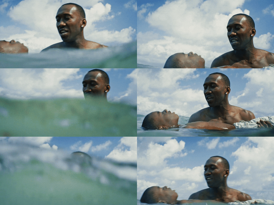
Moonlight by Barry Jenkins is a film seen through the point of view of the main character, Chiron. The film remains in Chiron’s perspective even as the character grows to be a teen and young adult. Over this time, the viewer gets to see Chiron interact with the people around him. Underlying these interactions is the fact that Jenkins makes sure to characterize as a shy, emotionally scarred individual. Thus, it is notable that he is able to form deep connections with some people. Among, the people he interacts with the most, Juan, Kevin, Paula, and Theresa, there appears to be a gender divide in the level of intimacy he has with these individuals. Aspects like the amount of contact, type of contact and color of the scene indicate the connection level difference between male and female. This serves as an indicator of Chiron’s sexuality.

Continue reading →

Spider-Man: Into the Spider-Verse, A Masterclass in the Intersection of Sound and Animation

SPIDER-MAN: INTO THE SPIDER-VERSE

by Aditya Tandon

Spider-Man: Into the Spider Verse hit cinemas with a storm in late 2018 as movie-goers of all ages came together to watch a new kind of Spider-Man film; not just because of the biracial protagonist, the presence of multiple spider-(wo)men, or the flawless comic-book styled animation, but because of how seamlessly all these pieces came together. It was a movie of many firsts, and it surpassed all expectations, later going on to win the Academy Award for Best Animated Film. I must confess, however, the first time I heard about the film and all the fanfare around it, I assumed it was just another super-hero movie being propped up by a loyal fanbase. It was only upon finally watching it that I realized how grossly mistaken I was; I noticed the enormous detail that went into both the animation as well as the plot, and how much the film was able to achieve through the intersection of animation and sound. All of this comes together in what is perhaps one of the most iconic scenes of the film, Miles’ “Leap of Faith,” embedded in full below.

Continue reading →

An Elephant Sitting Still: A Sontagian Read

by Kelly Mu

For me personally, Against Interpretation by Susan Sontag was perhaps the most impactful reading of the quarter. Its defiance of a long tradition of hermeneutics seemed relatable but also revolutionary. It shed light on a question that I have always struggled with, whether in reading literary works or watching a film. That is, how am I supposed to engage with a piece? Do I critically analyse every imagery and cinematic technique, or simply let my emotions consume me? An Elephant Sitting Still, a four hour Chinese film by the deceased director Hu Bo, was a chance for me to do both and reflect on their effectiveness.

Continue reading →